


 Hi Everyone!! So a few weeks ago I asked on the forums what you all would like to see in the future blog posts, and the idea of a behind the scenes inspiration post was suggested. :D I really liked this idea, though I had never done it before and was a little nervous to do so. Well with the last LO I did, I gave it a try! :D
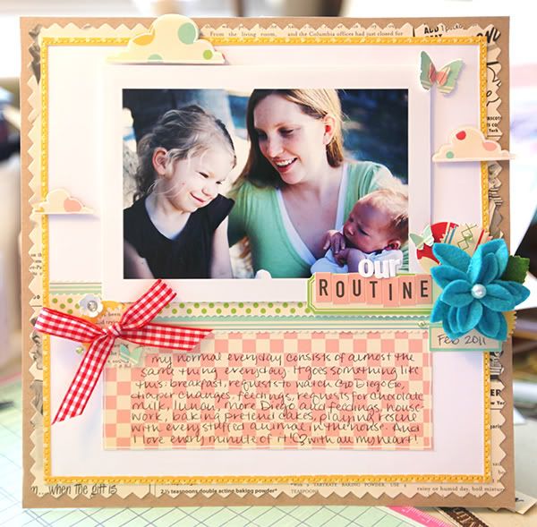
I am going to begin by sharing with you all the inspirations I picked when prepping for this layout. I feed very much off of other sources for inspiration, and right now there are a couple scrappers out there who's styles I am really liking! So below I have three layouts, by three different scrappers, and I used these three layouts in different ways to achieve the look I wanted.
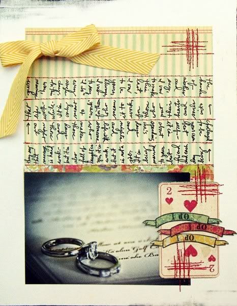
First up is 'I Do' by Jill Sprott-found in this blog post. I LOVE this layout! :D The simplicity, and the journaling, and the design is just gorgeous. I really wanted to incorporate this simple design in my LO, and you will notice that it is kind of there. Just slightly reversed. I have the bow, the section of patterned paper for journaling that is opposite my picture, and even though I have more embellishing on my layout than Jill has on her's, I still kept things really simple and minimal.
Next up is Jen Jockish. She has been a fav of mine for a very long time. I just can't get enough of her style! She was just recently the Guest Designer over at October Afternoon, and she used the Modern Homemaker line (featured in the Noel Mignon Delightfully Domestic kit) for some of her guest work. I used these pieces as color balance inspiration. I tried to mimic how she used all the papers together, the balance of papers and colors is fantastic. Her layouts look light yet graphic, and very pleasing to the eye.

And last up is a layout by our own Stephanie Wheeler! When I first saw this layout I was amazed! :D Love it! My favorite thing about it is the stitched border. If you look at my layouts for the last year or so, you will see that I use this idea a lot! It not only frames your layout and adds great texture, but can give your layout a very subtle color pop depending on what paper you use! As I said I love this detail, and use it quite often. :D
 So now I will begin to explain the beginning process. So my layout is actually sized about 8 1/2 x 8 1/2 inches. I like to make smaller layouts a lot. :D I chose my fav paper (Floursack) for the journaling below my picture, and decided I would go with Party Line as my accent border. I just wanted a little pop of yellow, not a whole ton of it. To create this border I cut two strips of paper, each a 1/2 inch thick. I then cut these in half length wise (just eyeballing it) so that they were each 1/4 inch thick. (I don't own a paper trimmer or a cutting mat that does 1/4 inch marks so if you happen to have those things your process will be a little different than mine). I adhered these strips with just a teeny dot of glue on each end so that they will stay in place while I sew through them. Then I chose the other side of Party Line for my background shaped paper cause I wanted some of the text, but just like the yellow not a whole ton of it. Then I used some kraft paper as my final background to balance it. I went with white cardstock as my main background because I realy wanted my layout to remain light and bright. So here is what it looks like when I have adhered everything background wise. I have my photo raised on pop dots (actually it is the negative of the pop dots as it gives a more solid ground for my photo to sit on).

Once all the glue has dried completely then I ran it through my sewing machine. This is fairly straight forward and simple, but you just have to go slow to make sure that you stay on the little strip of paper. I used a coordinating thread to maintain my yellow color pop. :D Here is a pic of what the stitching looks like.

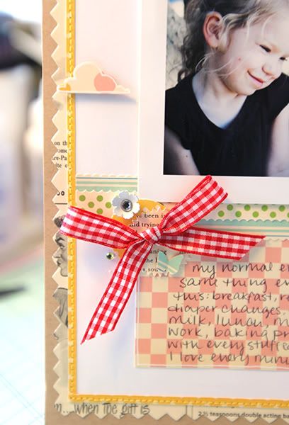
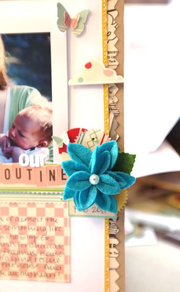
After that, everything was done at night so I have no more pics until the finished product. :P But the rest is pretty easy. I used a couple pieces of paper as strips across the middle of my layout, both for balance and some more color. I cut some clouds out of the Snickerdoodles paper and used my white gel pen to outline them. I knew I wanted to use the bright blue Maya Road flower because I had some of that same color in the background of my photo and thought they would work well together. And I definitely wanted to use the red My Mind's Eye ribbon because I needed the red color pop in there and the ribbon would give my LO some depth and texture. I used a few punched circles of paper to reaffirm the color scheme and patterns, and some of the label stickers to put my title and date on. :D A couple rhinestones, butterflies, and a little white flower and it is done!! :D As I said, fairly straight forward. :P This probably wasn't the most exciting layout for me to do a behind the scenes with but it was a start for me! I will attempt another real soon on a much more detailed and layered layout!
Hope you enjoyed my tutorial!! Thanks for making it all the way through!
Take Care! ~Amy


