There is an art to scrapbooking!
Scrapbooking is based on some of the same basic design rules as
painting/drawing, graphic design,
interior decorating, photography, landscaping, etc!
So I've got some things for you to think about that may help your scrapbooking design.
There is a basic rule called the
"Rule of Odds".
The gist of this rule is that things arranged in odd numbers
are more pleasing to the eye.
When making a layout, card, or project think about using things like pictures, embellishments, and papers in groups of 3, 5, 7, and so on!
There is a similar rule called the
"Rule of 3's".
The basic gist of this rule is that things arranged in 3s are more appealing, memorable, and pleasing to the eye than other numbers of objects.
OK so let's look at some examples of these rules in action...
Check out this layout by Virginia.
She's got 3 pictures, a cluster of 3 pumpkins at the top, and a cluster of 5 pumpkins at the bottom.
She used corrugated cardboard on 3 different places on this page.
(can you find them?)
She's even got 3 different areas where she has clustered embellies and/or journaling: a
bove the pictures, to the right of the pics, and then below the pics.

Way to abide by the rules Virginia!
:)
*****
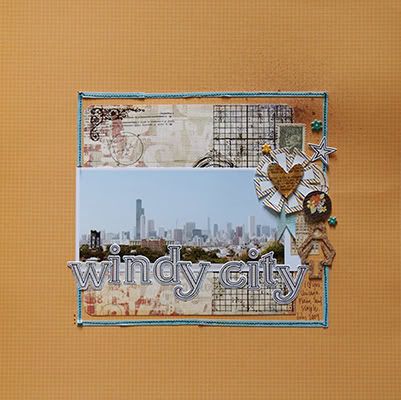
There are some good "odds" in this layout by Kim.
She used 5 pictures.
There are 7 flags in the banner she created.
She even did her journaling on a cluster of 3 label stickers above the pictures on the left side of the page.

*****
Look at this one that I made for the "Stampy McStamperson" challenge.
I've got 3 stamped images, 3 buttons, and 3 asterick thingys from the pack of American Crafts Thickers to embellish around the picture.
I used the striped paper (which I adore) in 5 different places around the edges of the page.

*****
Look at this one that Noel made using the Bedford Falls kit.
She has some less obvious "odds" going on here!
She used 3 main colors: blue, red, and green.
She has text distributed in 3 places: the title with the tiny alpha stickers, the journaling block, and then the "Merry Christmas" tag on the left corner of the picture.
There are 3 stars under the "star" in the title of the layout.
She used 3 different strips of patterned paper underneath the pictures.

See!!
There are odds everywhere!
:)
*****
OK now check out this one that Leah just posted with the Mary Ellen kit.
This one is interesting!
She has her layout divided up into 3 sections by using different patterned papers.
She has created a distinct left side, middle section, and left side.
She used 3 buttons.
It looks like she has used 3 prominent colors: green, blue, and red.
She has 3 clusters of embellies: bottom left corner of the page, bottom right corner of picture, and then at the top right corner of the picture.
Leah has all kinds of 3's going on here!

OK I hope these tips/rules help you the next time you start to put together a project!
Let me know if you have any questions!
:)
gretchen


 Get in different angles and get close up shots (zoom in!). We scrapbookers love to see the little details! To do this, use your "macro" setting on your camera (usually looks like a little flower or tulip).
 Sometimes I lean it up against something and stand away to get a good shot of it.


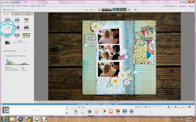 Here's a shot from in the yard. You can use the "Straighten" tool to get it a perfect square. Just look at the gridlines on the screen and line up one edge of the layout to them, using the adjuster on the bottom.
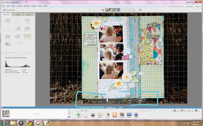 Then crop, using the crop tool (manual). You'll just grab the edges and pull them in as close to the edges as possible.